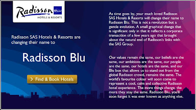
We are all for name changes. In fact we encourage it, in many cases. However, this one from Radisson is odd. First take a look at this from their website:
Our values remain the same, our beliefs are the same, our ambitions are the same, our people are the same, our hotels are the same, and our Blu box that allows us to stand out from the global Radisson crowd, remains the same. The world’s favourite colour will soon come to represent a cool, calm and collective Radisson hotel experience. The more things change, the more they stay the same. Radisson Blu, you’ll soon forget it was ever known as anything else.”
If that isn’t clear, Gordon McKinnon vice-president of branding explains: “Our customers are used to a difference between Radisson SAS and simply Radisson and we wanted to keep that differentiation there by using “Blu” in the title, in reference to the previous use of a blue box in the logo.” He also said he hoped the rebrand would win more customers.
What?
Let’s suspend reality for a moment and say that that makes sense. OK, why BLU and not BLUE or even BLEU for that European flair? It just looks like someone forgot to type the “e”.
P.S. Hey cybersquatters!
